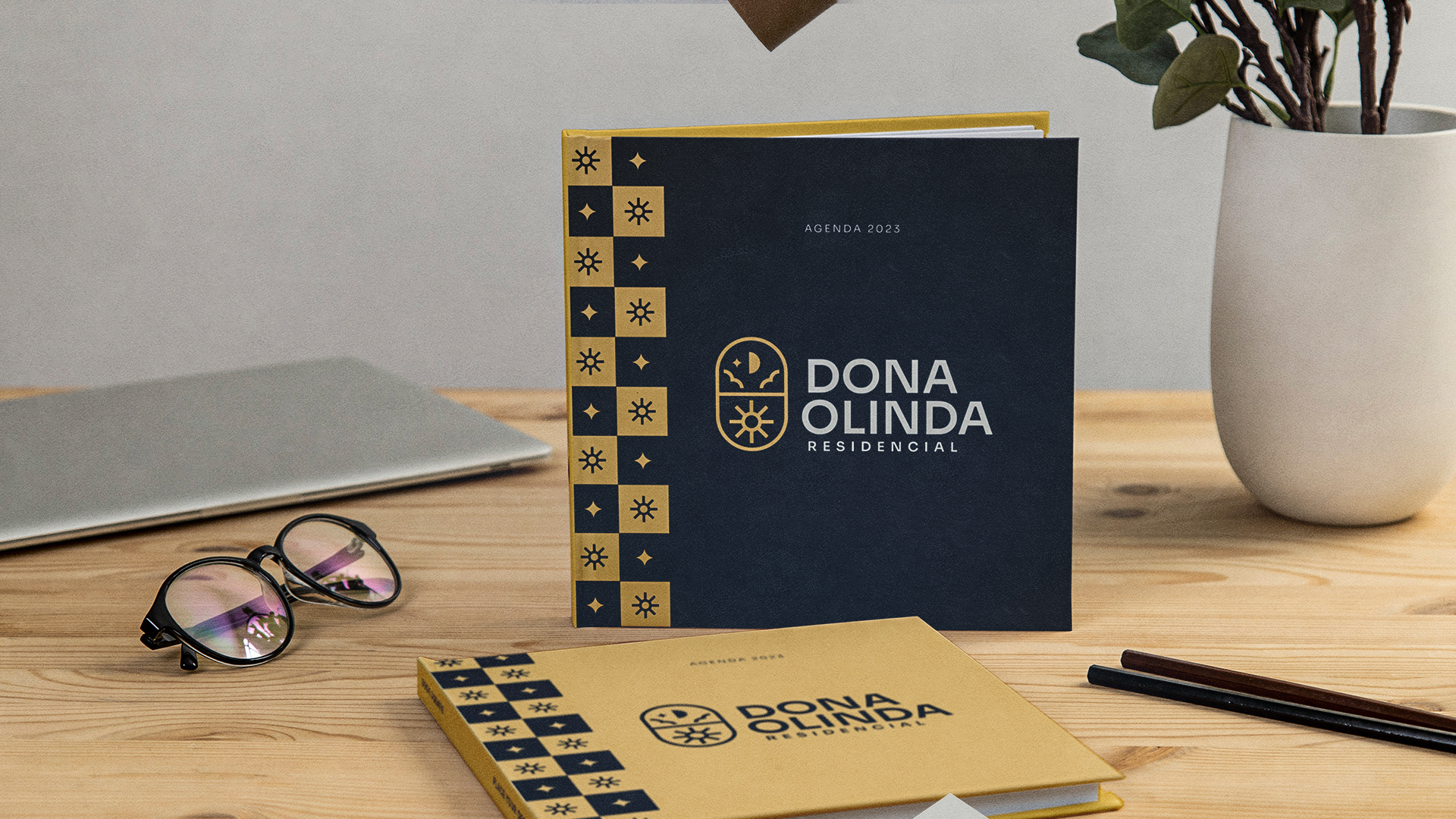
This project is dedicated to establishing a distinctive visual identity for a residential community located in Rio Fortuna, Santa Catarina, Brazil. The primary objective of our design endeavor is to seamlessly integrate the name "Dona Olinda" as a heartfelt tribute to the owner's mother, infusing the visual identity with a sense of familial reverence and significance.
1
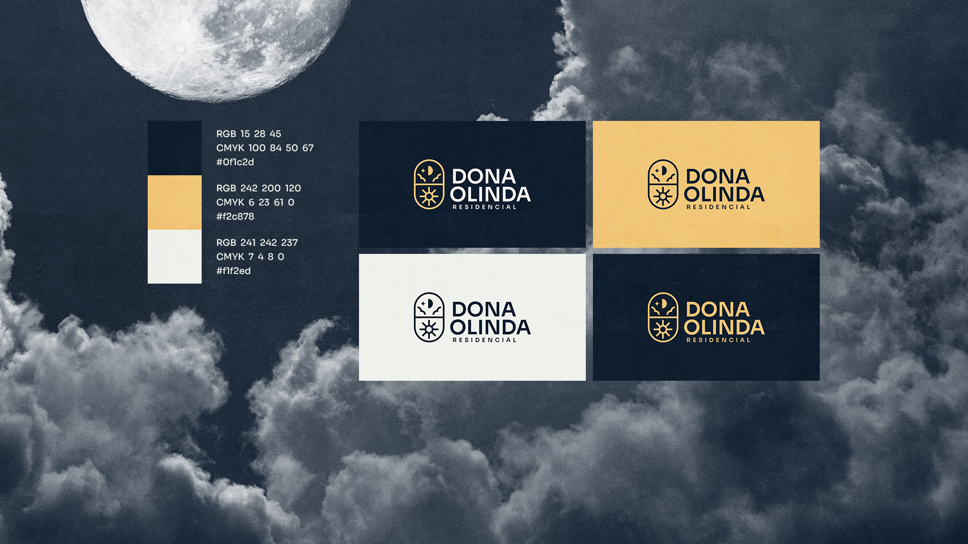
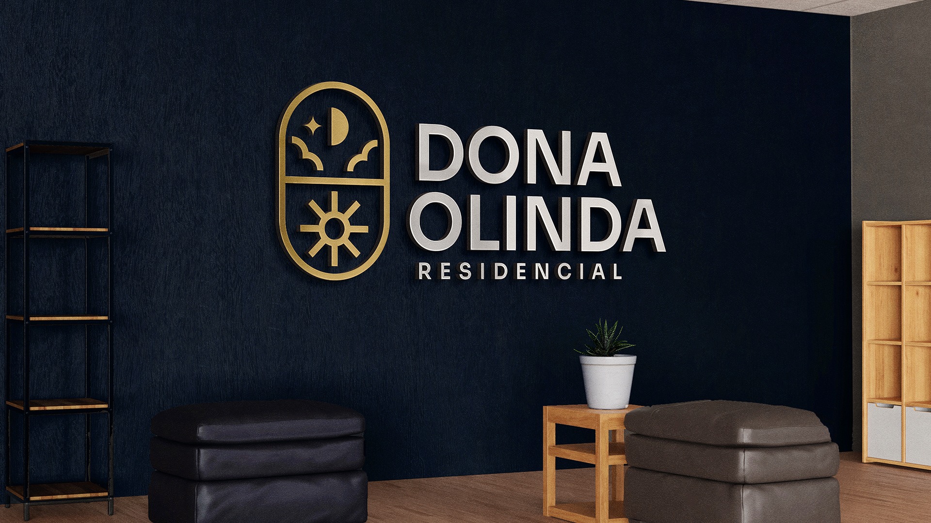
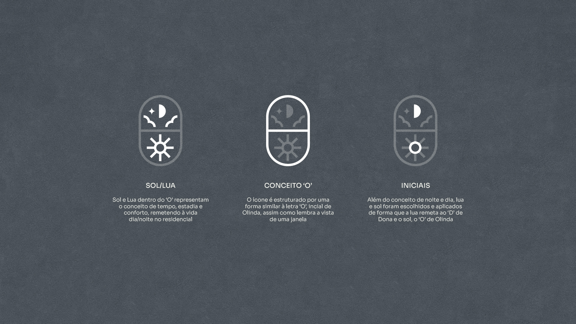
SUN/MOON
The Sun and Moon inside the 'O' represent the concept of time, stay, and comfort, alluding to the day/night life in the residential area.
2
THE LETTER 'O'
The icon is structured in a shape similar to the letter 'O,' the initial of 'Olinda,' while also resembling the view from a window.
3
THE INITIALS
In addition to the concept of night and day, the moon and the sun were chosen and applied in a way that the moon refers to the 'D' in 'Dona,' and the sun represents the 'O' in 'Olinda.'